
6.8 Add annotations
The labels for the sectors can be added by setting show.sector.labels = TRUE, however, this does not provide any customization on the labels. Users can customize their own labels by self-defining a panel.fun function, demonstrated as follows. Here the labels are added 2mm away from the heatmap track (by convert_y(2, "mm") which defines the offset in the y-direction).
Here I set track.index = get.current.track.index() to make sure the labels are always added in the correct track.
circos.heatmap(mat1, split = split, col = col_fun1)
circos.track(track.index = get.current.track.index(), panel.fun = function(x, y) {
    circos.text(CELL_META$xcenter, CELL_META$cell.ylim[2] + convert_y(2, "mm"),
        paste0("this is group ", CELL_META$sector.index),
        facing = "bending.inside", cex = 0.8,
        adj = c(0.5, 0), niceFacing = TRUE)
}, bg.border = NA)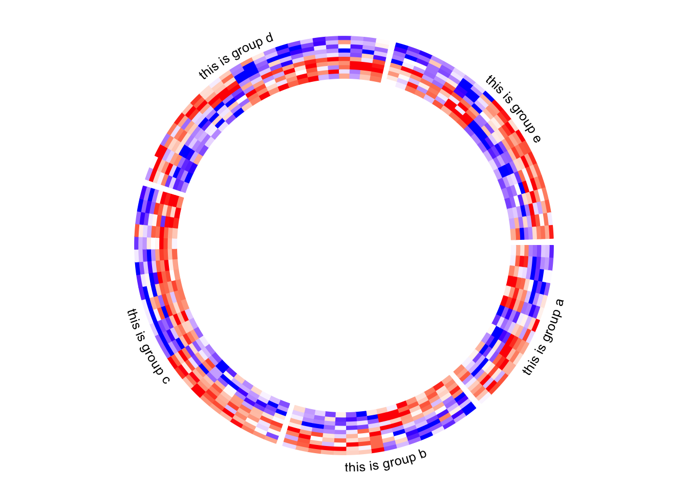

circos.clear()Column names of the matrix are not directly supported by circos.heatmap(), but they can be easily added also by self-defining a panel.fun function. In followig example, I set larger space (10 degrees, users normally need to try several values to get a best space) after the last sector (the fifth sector) by gap.after parameter in circos.par(), later I draw the column names in the last sector in panel.fun.
circos.par(gap.after = c(2, 2, 2, 2, 10))
circos.heatmap(mat1, split = split, col = col_fun1, track.height = 0.4)
circos.track(track.index = get.current.track.index(), panel.fun = function(x, y) {
    if(CELL_META$sector.numeric.index == 5) { # the last sector
        cn = colnames(mat1)
        n = length(cn)
        circos.text(rep(CELL_META$cell.xlim[2], n) + convert_x(1, "mm"),
            1:n - 0.5, cn,
            cex = 0.5, adj = c(0, 0.5), facing = "inside")
    }
}, bg.border = NA)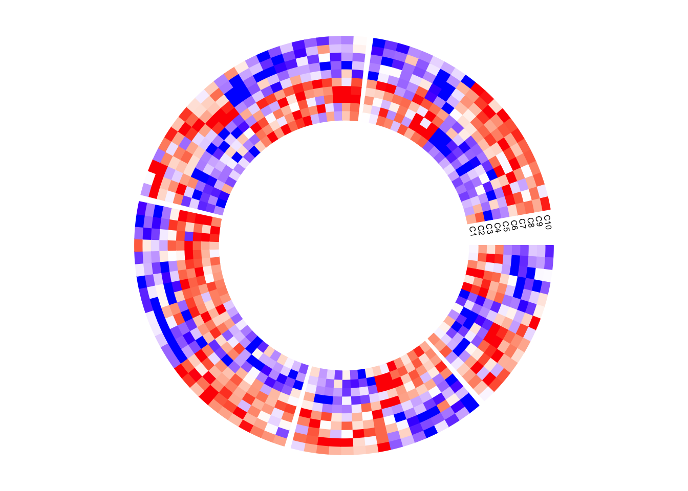
circos.clear()Next example adds rectangles and labels to show the two groups of columns in the matrix. The code inside panel.fun is simple. It basically draws rectangles and texts. convert_x() converts a unit on the x-direction to a proper value measured in tbe circular coordinate system.
circos.par(gap.after = c(2, 2, 2, 2, 10))
circos.heatmap(mat1, split = split, col = col_fun1, track.height = 0.4)
circos.track(track.index = get.current.track.index(), panel.fun = function(x, y) {
    if(CELL_META$sector.numeric.index == 5) { # the last sector
        circos.rect(CELL_META$cell.xlim[2] + convert_x(1, "mm"), 0,
                    CELL_META$cell.xlim[2] + convert_x(5, "mm"), 5,
                    col = "orange", border = NA)
        circos.text(CELL_META$cell.xlim[2] + convert_x(3, "mm"), 2.5,
                    "group 1", cex = 0.5, facing = "clockwise")

        circos.rect(CELL_META$cell.xlim[2] + convert_x(1, "mm"), 5,
                    CELL_META$cell.xlim[2] + convert_x(5, "mm"), 10,
                    col = "pink", border = NA)
        circos.text(CELL_META$cell.xlim[2] + convert_x(3, "mm"), 7.5,
                    "group 2", cex = 0.5, facing = "clockwise")
    }
}, bg.border = NA)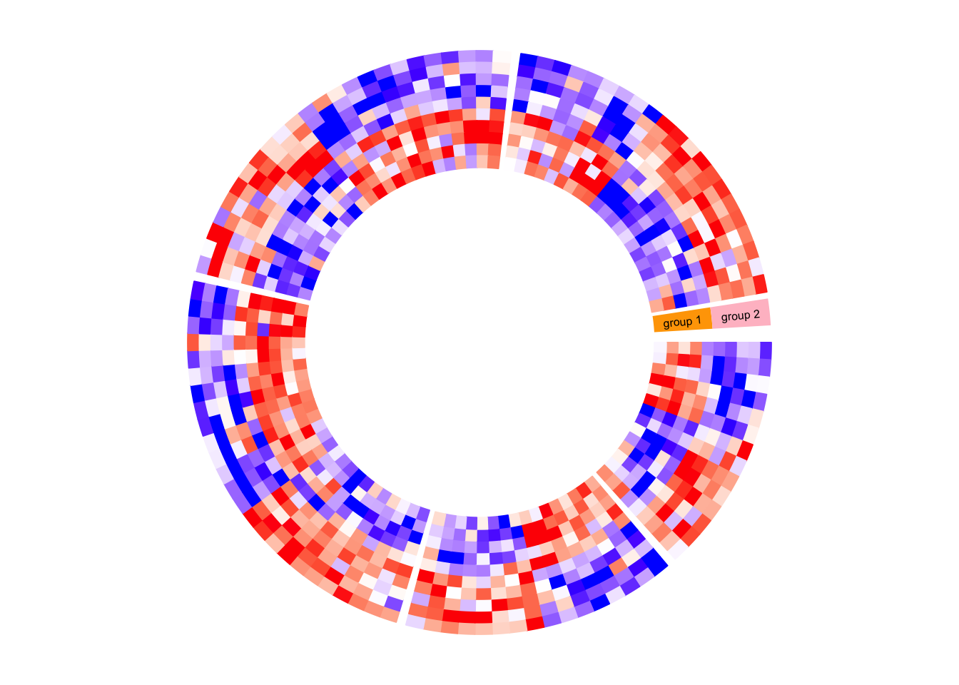
circos.clear()circlize does not generates legends, but the legends can be manually generated by ComplexHeatmap::Legend() function and added to the circular plot. Following is a simple example of adding a legend. In the next section, you can find a more complex example of adding many legends.
circos.heatmap(mat1, split = split, col = col_fun1)
circos.clear()

library(ComplexHeatmap)
lgd = Legend(title = "mat1", col_fun = col_fun1)
grid.draw(lgd)
6.9 A complex example of circular heatmaps
In this section, I will demonstrate how to make complex circular heatmaps. The heatmaps in the normal layout are in the following figure and now I will change them with the circular layout.
The heatmaps visualize correlations between DNA methylation, gene expression and other genome-level information. You can go to this link to see how the original heatmaps were generated.

The original heatmaps were generated with random datasets. The code for generating them is available at https://gist.github.com/jokergoo/0ea5639ee25a7edae3871ed8252924a1. Here I just directly source the script from Gist.
source("https://gist.githubusercontent.com/jokergoo/0ea5639ee25a7edae3871ed8252924a1/raw/57ca9426c2ed0cebcffd79db27a024033e5b8d52/random_matrices.R")Similar as the original heatmap, rows of all heatmaps are split into 5 groups by applying k-means clustering on rows of the methylation matrix (mat_meth).
set.seed(123)
km = kmeans(mat_meth, centers = 5)$cluster
Now there are following matrices/vectors that need to be visualized as heatmaps:
mat_meth: a matrix in which rows correspond to differetially methylated regions (DMRs). The value in the matrix is the mean methylation level in the DMR in every sample.mat_expr: a matrix in which rows correspond to genes which are associated to the DMRs (i.e. the nearest gene to the DMR). The value in the matrix is the expression level for each gene in each sample. Expression is scaled for every gene across samples.direction: direction of the methylation change (hyper meaning higher methylation in tumor samples, hypo means lower methylation in tumor samples).cor_pvalue: p-value for the correlation test between methylation and expression of the associated gene. Values are -log10 transformed.gene_type: type of the genes (e.g., protein coding genes or lincRNAs).anno_gene: annotation to the gene models (i.e., intergenic, intragenic or transcription start site (TSS)).dist: distance from DMRs to TSS of the assiciated genes.anno_enhancer: fraction of each DMR that overlaps enhancers.
Among these variables, mat_meth, mat_expr, cor_pvalue, dist and anno_enhancer are numeric and I set color mapping functions for them. For the others I set named color vectors.
In the following code, I specify split in the first call of circos.heatmap() which is the methylation heatmap. The track heights are manually adjusted.
col_meth = colorRamp2(c(0, 0.5, 1), c("blue", "white", "red"))
circos.heatmap(mat_meth, split = km, col = col_meth, track.height = 0.12)

col_direction = c("hyper" = "red", "hypo" = "blue")
circos.heatmap(direction, col = col_direction, track.height = 0.01)

col_expr = colorRamp2(c(-2, 0, 2), c("green", "white", "red"))
circos.heatmap(mat_expr, col = col_expr, track.height = 0.12)

col_pvalue = colorRamp2(c(0, 2, 4), c("white", "white", "red"))
circos.heatmap(cor_pvalue, col = col_pvalue, track.height = 0.01)

library(RColorBrewer)
col_gene_type = structure(brewer.pal(length(unique(gene_type)), "Set3"), names = unique(gene_type))
circos.heatmap(gene_type, col = col_gene_type, track.height = 0.01)

col_anno_gene = structure(brewer.pal(length(unique(anno_gene)), "Set1"), names = unique(anno_gene))
circos.heatmap(anno_gene, col = col_anno_gene, track.height = 0.01)

col_dist = colorRamp2(c(0, 10000), c("black", "white"))
circos.heatmap(dist, col = col_dist, track.height = 0.01)

col_enhancer = colorRamp2(c(0, 1), c("white", "orange"))
circos.heatmap(anno_enhancer, col = col_enhancer, track.height = 0.03)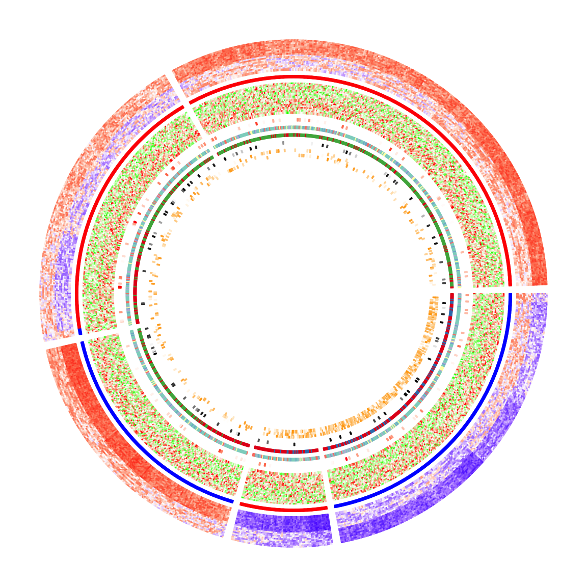
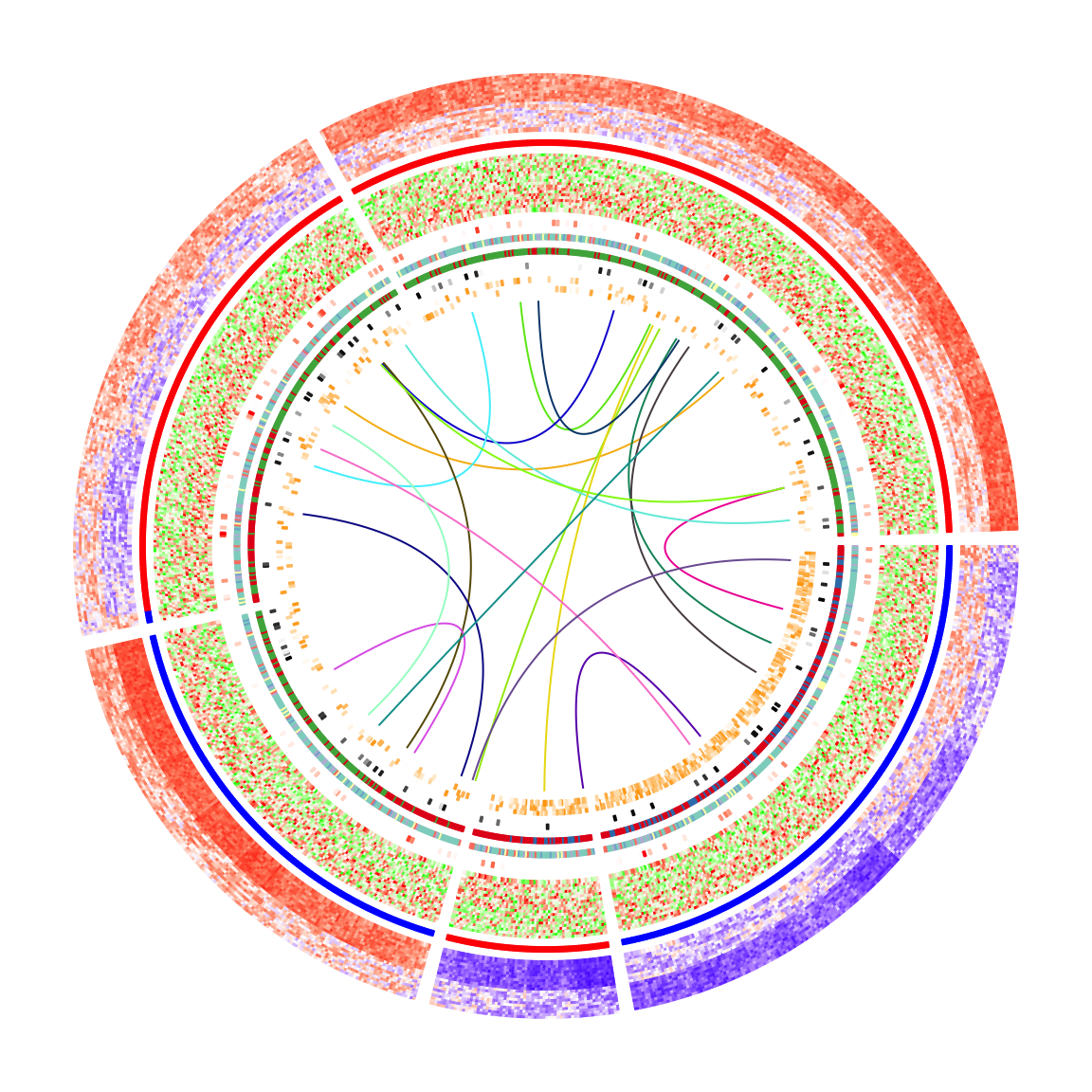
circos.clear()The circular heatmaps look pretty! Since rows in the matrices are genomic regions (the differentially methylated regions), if we can establish connections between some of the regions, e.g. physical interactions in the 3D chromosome structure, the plot would be nicer and more useful.
In following code, I generate some random interactions between DMRs. Each row in df_link means there is an interaction from the ith DMR to the jth DMR.
df_link = data.frame(
    from_index = sample(nrow(mat_meth), 20),
    to_index = sample(nrow(mat_meth), 20)
)
Finding the positions of these DMRs on the circular heatmaps is tricky. Check the comments in the following code. Note here the subset and row_order meta data are retrieved by get.cell.meta.data() function by explicitly specifying the sector index.
for(i in seq_len(nrow(df_link))) {
    # Let's call the DMR with index df_link$from_index[i] as DMR1,
    # and the other one with index df_link$to_index[i] as DMR2.

    # The sector where DMR1 is in.
    group1 = km[ df_link$from_index[i] ]
    # The sector where DMR2 is in.
    group2 = km[ df_link$to_index[i] ]

    # The subset of DMRs (row indices from mat_meth) in sector `group1`.
    subset1 = get.cell.meta.data("subset", sector.index = group1)
    # The row ordering in sector `group1`.
    row_order1 = get.cell.meta.data("row_order", sector.index = group1)
    # This is the position of DMR1 in the `group1` heatmap.
    x1 = which(subset1[row_order1] == df_link$from_index[i])

    # The subset of DMRs (row indices from mat_meth) in sector `group2`.
    subset2 = get.cell.meta.data("subset", sector.index = group2)
    # The row ordering in sector `group2`.
    row_order2 = get.cell.meta.data("row_order", sector.index = group2)
    # This is the position of DMR2 in the `group2` heatmap.
    x2 = which(subset2[row_order2] == df_link$to_index[i])

    # We take the middle point and draw a link between DMR1 and DMR2
    circos.link(group1, x1 - 0.5, group2, x2 - 0.5, col = rand_color(1))
}
To make things easier, I implemented a function circos.heatmap.link() that basically wraps the code above. Now drawing links between matrix rows is simpler:
for(i in seq_len(nrow(df_link))) {
    circos.heatmap.link(df_link$from_index[i],
                        df_link$to_index[i],
                        col = rand_color(1))
}
After adding the links, the plots look nicer!
Legends are important for understanding heatmaps. Unfortunately, circlize does not naturally support legends, however, the circlize plots can be combined with the legends generated fromComplexHeatmap::Legend(). Following the instructions from that link, we need a function that draws the circlize plot and a Legends object (which is a grid::grob object).
The function that draws the circular plot is simply a wrapper of the previous code without any modification.
circlize_plot = function() {
    circos.heatmap(mat_meth, split = km, col = col_meth, track.height = 0.12)
    circos.heatmap(direction, col = col_direction, track.height = 0.01)
    circos.heatmap(mat_expr, col = col_expr, track.height = 0.12)
    circos.heatmap(cor_pvalue, col = col_pvalue, track.height = 0.01)
    circos.heatmap(gene_type, col = col_gene_type, track.height = 0.01)
    circos.heatmap(anno_gene, col = col_anno_gene, track.height = 0.01)
    circos.heatmap(dist, col = col_dist, track.height = 0.01)
    circos.heatmap(anno_enhancer, col = col_enhancer, track.height = 0.03)

    for(i in seq_len(nrow(df_link))) {
        circos.heatmap.link(df_link$from_index[i],
                            df_link$to_index[i],
                            col = rand_color(1))
    }
    circos.clear()
}
The legends can be generated from the color mapping functions and color vectors. The ComplexHeatmap::Legend() function is very flexible that you can customize the labels on the legends (see how lgd_pvalue, lgd_dist and lgd_enhancer are defined).
lgd_meth = Legend(title = "Methylation", col_fun = col_meth)
lgd_direction = Legend(title = "Direction", at = names(col_direction),
    legend_gp = gpar(fill = col_direction))
lgd_expr = Legend(title = "Expression", col_fun = col_expr)
lgd_pvalue = Legend(title = "P-value", col_fun = col_pvalue, at = c(0, 2, 4),
    labels = c(1, 0.01, 0.0001))
lgd_gene_type = Legend(title = "Gene type", at = names(col_gene_type),
    legend_gp = gpar(fill = col_gene_type))
lgd_anno_gene = Legend(title = "Gene anno", at = names(col_anno_gene),
    legend_gp = gpar(fill = col_anno_gene))
lgd_dist = Legend(title = "Dist to TSS", col_fun = col_dist,
    at = c(0, 5000, 10000), labels = c("0kb", "5kb", "10kb"))
lgd_enhancer = Legend(title = "Enhancer overlap", col_fun = col_enhancer,
    at = c(0, 0.25, 0.5, 0.75, 1), labels = c("0%", "25%", "50%", "75%", "100%"))
Now we use the gridBase to combine both base graphics (circlize is implemented with the base graphics) and grid graphics (ComplexHeatmap is implemented with the grid graphics). You can just use the following code as a template for your plot if you want to try.
And, BINGO! Wie schön!!
library(gridBase)
plot.new()
circle_size = unit(1, "snpc") # snpc unit gives you a square region

pushViewport(viewport(x = 0, y = 0.5, width = circle_size, height = circle_size,
    just = c("left", "center")))
par(omi = gridOMI(), new = TRUE)
circlize_plot()
upViewport()

h = dev.size()[2]
lgd_list = packLegend(lgd_meth, lgd_direction, lgd_expr, lgd_pvalue, lgd_gene_type,
    lgd_anno_gene, lgd_dist, lgd_enhancer, max_height = unit(0.9*h, "inch"))
draw(lgd_list, x = circle_size, just = "left")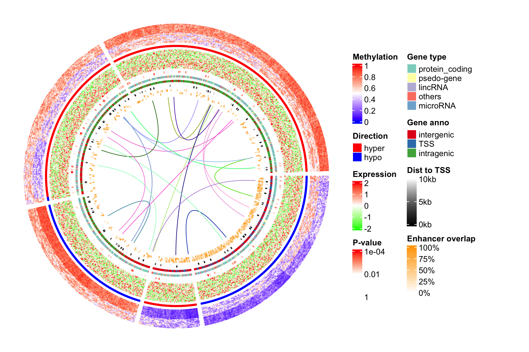
本站原创,如若转载,请注明出处:https://www.ouq.net/2669.html
 微信打赏,为服务器增加50M流量
  支付宝打赏,为服务器增加50M流量